

Choosing the Perfect Paint Color: A Comprehensive Guide
Selecting the right paint color for your home is more than just picking a shade you like. This is why so many clients get stuck at this stage. One of the services I provide most in my practice is paint color consultations. Picking paint colors for a particular space involves understanding how colors interact with light, both natural and artificial, and how color can affect the mood and perception of a room. Today we'll explore key factors that influence how your paint colors will appear to the eye such as; Light Reflectance Value (LRV), the effects of natural light from different cardinal directions, Kelvin light temperature of artificial light sources, the Color Rendering Index (CRI), and basic color theory. By the end, you'll be able to make a much more informed decision on the perfect paint color for your space.
Understanding Light Reflectance Value (LRV)

What the heck is Light Reflectance Value (LRV) and why is it so important? LRV is measured as a percentage of the light that a color reflects back on a scale from zero: absolute black absorbing all light, to 100: pure white reflecting all light. The higher the LRV of a color, the MORE light will be reflected and vice versa. In general, lighter colors have higher LRVs (reflect more light) while darker colors have lower LRVs (absorb more light).
How can we use LRV when choosing paint colors?
We can use LRV to predict how light or dark a color will appear to the human eye and how that visual perception will affect how the space feels:
High LRV (60-100): Colors with high LRV reflect more light, making a room appear brighter and more spacious. They are ideal for small rooms or spaces with limited natural light.
Medium LRV (30-60): These colors balance light reflection and absorption, suitable for most rooms.
Low LRV (0-30): Colors with low LRV absorb more light, creating a cozy, intimate feel. These are perfect for large, well-lit rooms or to create a dramatic effect.
An LRV of around 50% is a common “sweet spot” for most residential interior paints
Lighting & Kelvin Color Temperature
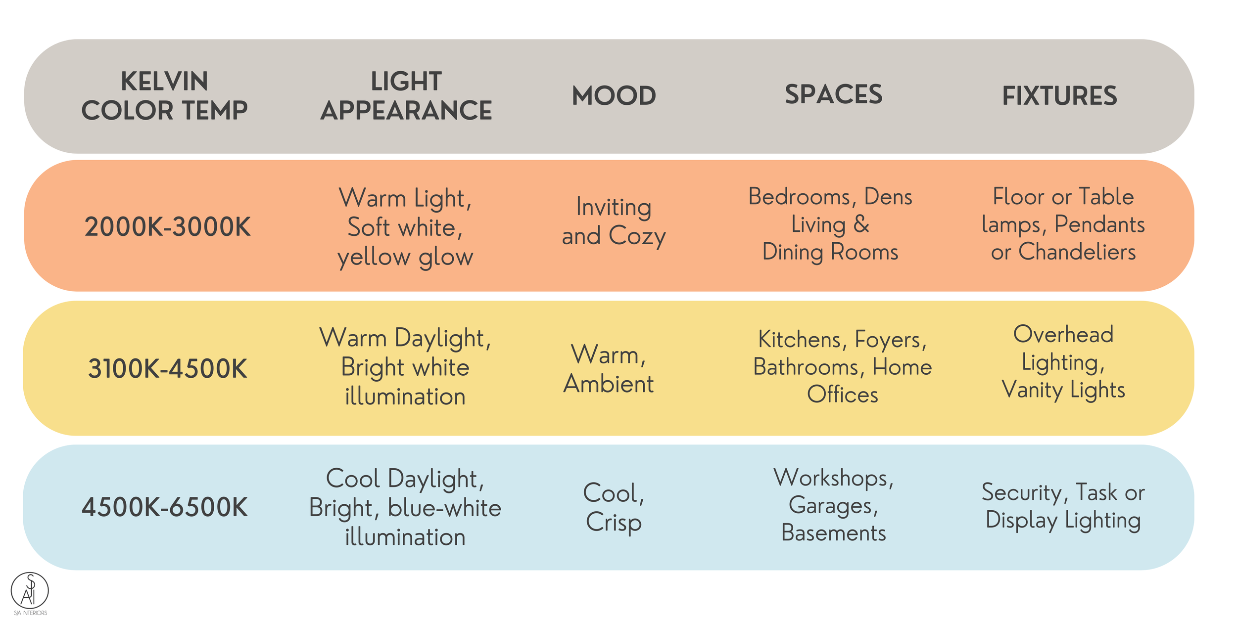
Artificial light also plays a significant role in how paint colors are perceived. Kelvin (K) is the unit used to measure the color temperature of light sources. A light bulb’s color temperature refers to the look and feel of the light produced and is measured in degrees of Kelvin (K) on a scale from 1,000 to 10,000. The warmer and more ambient lighting that we typically encounter in our everyday lives in residential settings typically falls between 2000K-4500K. The harsher task lighting in ancillary residential or commercial settings typically falls between 4500K-6500K.
Warm Light (2000K-3000K): Mimics the warm glow of sunlight during sunrise or sunset. It enhances warm colors and adds coziness to a room.
Neutral Light (3100K-4500K): Provides balanced, white light similar to midday sun. It works well with both warm and cool colors.
Cool Light (4600K-6500K): Resembles daylight and is often used in offices or workspaces. It can enhance cool colors and create a clean, crisp ambiance.
Choosing the Kelvin Temperature of Light Sources

Most incandescent and halogen bulbs are available in a limited Kelvin color temperature range of 2700K-3000K.
Fluorescent, metal halide and LED bulbs provide more flexibility in terms of color temperature and can be purchased with options ranging from 2700K to 6500K with some bulbs or fixtures offering customizable color temp settings.
The Effects of Natural Light on Paint Colors
Natural light varies depending on the direction it comes from, impacting how paint colors appear throughout the day.
North-Facing Rooms:
These rooms receive consistent, cool natural light.
Colors that work best: Vibrant colors, warm neutrals, warm grays, yellow-tones whites, colors with balanced warm-cool undertones and dark colors.
Colors that are not recommended: Cool greens or cool blues

East-Facing Rooms:
These spaces receive bright, warm light in the morning and cooler light later in the day.
Colors that work best: Warmer, bright or light colors, warm whites, light warm grays, light, airy colors like light blue or blush, soft blues or greens
Colors that are not recommended: Very pale hues or colors with cool undertones

South-Facing Rooms:
Bathed in warm, intense light throughout the day, south-facing rooms rooms can handle cooler tones (blues, greens) to balance the warmth. Darker colors can also look vibrant.
Colors that work best: Cooler colors, cool whites, blue-tons grays, gray-tones neutrals, moody, dark color
Colors that are not recommended: Hues with a lot of warmth
West-Facing Rooms:
These get warm, golden light in the late afternoon and evening. Cool tones (blues, greens) can help offset the warm evening light.
Colors that work best: Cooler colors, cool whites, blue-tons grays, gray-tones neutrals, moody, dark colors
Colors that are not recommended: Hues with a lot of warmth
Color Rendering Index (CRI)
The Color Rendering Index (CRI) is a measurement that tells us how a particular light source will shows an object’s colors "naturally" as compared to daylight or incandescent light. CRI is measured on a scale from 0 to 100. At zero, all colors will look identical. At 100, the true colors of an object are visible. Generally speaking, the higher the CRI, the “truer” the colors will appear.
CRI and Paint Colors:
A paint color will appear “truest” under natural light, the basis of CRI. To mimic this with an artificial light source, use a bulb with a CRI over 90 and as close to 100 CRI (natural daylight) as possible to experience the truest perception of the color your eyes can register. The lower a bulb’s CRI, the less “true” a paint color will appear as it is further from true natural light.
Note that CRI is different than a light source’s Kelvin color temperature. For example, a fluorescent light with a 5000K CRI 70 won’t render color, or allow your eye to perceive color, as well as a 5000K fluorescent with CRI 90 (see the apple example below).

Ligting and CRI:
Light sources with a CRI of 80-90 are considered good while those with a CRI of 90 or more are considered excellent.
Incandescent and halogen bulbs have a CRI of 100
Most LEDs have a CRI of 80-90
Fluorescent bulbs range from 50 to 98
Applying Color Theory

Color theory is an essential tool in choosing paint colors. It tells us how different hues will interact with one another and create visual harmony or chaos. Color theory encompasses principles like complementary colors, which are opposite each other on the color wheel and create vibrant contrast, and analogous colors, which sit next to each other and offer a more cohesive, calming effect. By understanding these relationships, you can better select color schemes that enhance the mood and aesthetic appeal of your spaces, whether aiming for a bold, energetic look or a serene, unified atmosphere.
Color theory helps in understanding how colors interact and how to create harmonious color schemes such as these common ones in design:

Monochromatic: Variations of a single color. It creates a cohesive, soothing look.
Analogous: Colors next to each other on the color wheel (e.g., blue, blue-green, green). This scheme is harmonious and pleasing to the eye.
Complementary: Colors opposite each other on the color wheel (e.g., blue and orange). This scheme offers high contrast and vibrant energy.
Triadic: Three colors evenly spaced on the color wheel (e.g., red, yellow, blue). This scheme is balanced yet lively.
Practical Tips for Choosing Paint Colors
1. Test Samples: Paint small sections of your wall and observe how the color changes throughout the day under different lighting conditions. Some manufacturers or third-party companies even have nicely sized peel-and-stick samples available for purchase so you don't have to buy those little pots of paint and stare at a bunch of different color swatches on your walls hoping that will somehow make it obvious which color is “the one.”.
2. Don't Forget to Consider Existing Elements: Take into account your materials, furniture, flooring, and decor. Choose colors that complement these elements.
3. Use Technology: Leverage paint company apps and websites that allow you to visualize colors in your space. Sherwin Williams, Behr and Benjamin Moore all have color visualizing tools where you can even upload photos of your actual space. You’ll find links to the color tools below this section.
4. Start with Neutrals: If you're unsure, start with neutral tones and add pops of color through accessories and accent walls.
Designer Take-aways
Choosing the right paint color is an art and a science. By understanding LRV, the effects of natural light, the Kelvin temperature of artificial light, CRI, and color theory, you can make informed decisions that enhance your home's aesthetics and ambiance. Take your time, test different options, and enjoy the process of transforming your space with the perfect paint color.